
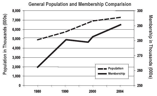
The second graphic in the Pre-Conference Journal aims at the heart of the problem we’re facing. The population of out part of the state continues to rise – and we’re not keeping up. The graph included in the report might lead one to believe we’re doing ok.
A careless reader would look at 1980 and see a big gap between membership and population and then look at 2004 and see a much smaller gap. How many people will notice that the scale for each line is quite different – one (the Population) varying by 1,000,000, the other (Membership) by 10,000? Is our general math literacy better than has been reported?
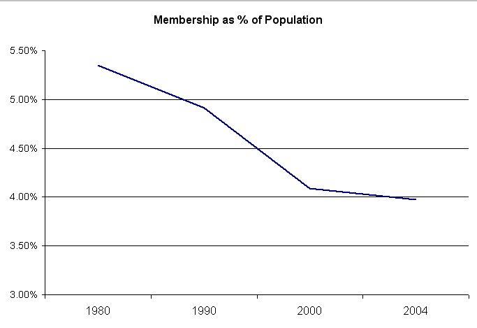
Let’s look at the same numbers differently. This figure graphs the percentage of the population reflected in the membership of the church. I believe this depicts the decline much more clearly.
